COVID-19 and EpiCompare
Source:dev/vignettes/not-built-vignettes/example-covid-19-us.Rmd
example-covid-19-us.RmdOverview
Data for the COVID-19 outbreak is available publicly from many sources including from the Johns Hopkins Coronavirus Tracker github repository ((Dong, Du, and Gardner 2020)). We want to use EpiCompare to compare outbreaks in different US states.
In this vignette, we assume a SIR disease progression. That is, individuals begin in the susceptible state, move to the infectious state, and then finally are recovered.
In this vignette, we will
Download JHU Coronavirus data via the
R COVID19package ((Guidotti, n.d.)).Convert to SI format.
Impute a random number of recovered based on infection duration estimates to make the data into SIR format.
Compare the states’ outbreaks using EpiCompare.
You will need to install/load the following packages.
Downloading the coronavirus data for the US
data <- covid19("USA", level = 2) %>%  ## State level US data, will take a few seconds
   mutate( state = administrative_area_level_2)
Hale Thomas, Sam Webster, Anna Petherick, Toby Phillips, and Beatriz Kira (2020). Oxford COVID-19 Government Response Tracker, Blavatnik School of Government.
The COVID Tracking Project (2020), https://covidtracking.com
Johns Hopkins Center for Systems Science and Engineering (2020), https://github.com
Guidotti, E., Ardia, D., (2020), “COVID-19 Data Hub”, Working paper, doi: 10.13140/RG.2.2.11649.81763.
To see these entries in BibTeX format, use ‘print(
To hide the data sources use ‘verbose = FALSE’.
data %>%
  select(id, state, date, confirmed, recovered, deaths, population) %>%
  head() %>% kable() %>% kable_styling(position = "center")
| id | state | date | confirmed | recovered | deaths | population |
|---|---|---|---|---|---|---|
| 121cd66e | Minnesota | 2020-01-12 | 0 | 0 | 0 | 5639632 |
| 121cd66e | Minnesota | 2020-01-13 | 0 | 0 | 0 | 5639632 |
| 121cd66e | Minnesota | 2020-01-14 | 0 | 0 | 0 | 5639632 |
| 121cd66e | Minnesota | 2020-01-15 | 0 | 0 | 0 | 5639632 |
| 121cd66e | Minnesota | 2020-01-16 | 0 | 0 | 0 | 5639632 |
| 121cd66e | Minnesota | 2020-01-17 | 0 | 0 | 0 | 5639632 |
data <- data %>% group_by(state)

ggplot(data = data, aes(x = date, y =confirmed / population,
                        group = state, col = state)) +
  geom_line() +
  xlim(c(as.Date("2020-03-16"), max(data$date) + 5)) +
  geom_text(data = . %>% filter(date == max(date)),
            aes(label = state), vjust = .001, hjust = 0)  +
  labs(x = "", y = "(Cumulative Confirmed Cases) / (Population Size)")  +  scale_colour_manual(values=rep(brewer.pal(5,"Set1"),
                                times= ceiling(length(unique(hagelloch_raw$HN)) / 5)),
                      guide = FALSE)
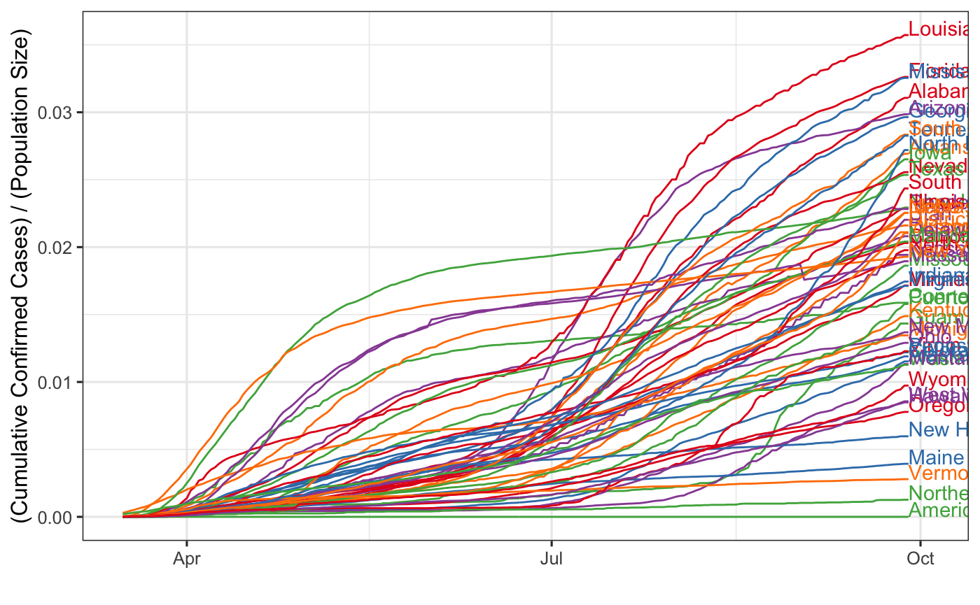
From this, it looks like the state dominates the others in terms of cumulative cases, even after adjusting for population size.
However, the outbreak did not begin on the same day in the states. So perhaps, we want to adjust for the timing. We can adjust the dates relative to the first case reported in the state.
This looks like the following:
data <- data %>%
  mutate( state = administrative_area_level_2) %>%
  group_by(state) %>% filter(confirmed > 0) %>%
  mutate(first_date = min(date)) %>%
  mutate(rel_date = date - first_date )

ggplot(data = data, aes(x = rel_date, y = confirmed / population, group = state,
                        col = state)) +
  geom_line() +
  xlim(c(0, max(data$rel_date) + 10)) +
  geom_text(data = . %>% filter(date == max(date)),
            aes(label = state), vjust = .001, hjust = 0)  +
  labs(x = "Days relative to first case in state",
       y = "(Cumulative Confirmed Cases) / (Population Size)") +
    scale_colour_manual(values=rep(brewer.pal(5,"Set1"),
                                times= ceiling(length(unique(hagelloch_raw$HN)) / 5)),
                      guide = FALSE)
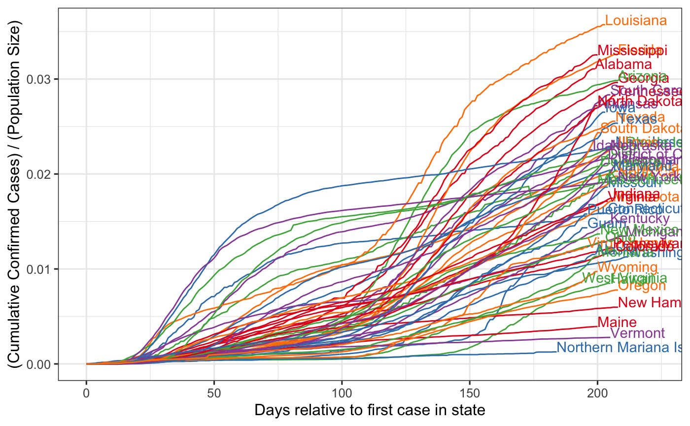
This view looks a little different from the raw-time version and now New York does not look to be completely dominant. On the other hand, this view makes it hard to compare states like MA, Illinois, CA, and AZ – states which all had an early case but did not have a sustained outbreak until much later.
Another idea is to standardize the time relative to the first time the .0005 cumulative cases per population threshold is crossed.
data2 <- data %>% group_by(state) %>% filter(confirmed/population > 0.0005) %>%
  mutate(first_date = min(date)) %>%
  mutate(rel_date = date - first_date)

ggplot(data = data2, aes(x = rel_date, y = confirmed / population, group = state,
                         col = state)) +
  geom_line() +
  xlim(c(0, max(data2$rel_date) + 5)) +
  geom_text(data = . %>% filter(date == max(date)),
            aes(label = state), vjust = .001, hjust = 0)  +
  labs(x = "Days relative to .0005 Cases/Pop threshold", y = "(Cumulative Confirmed Cases) / (Population Size)") +
    scale_colour_manual(values=rep(brewer.pal(5,"Set1"),
                                times= ceiling(length(unique(hagelloch_raw$HN)) / 5)),
                      guide = FALSE)
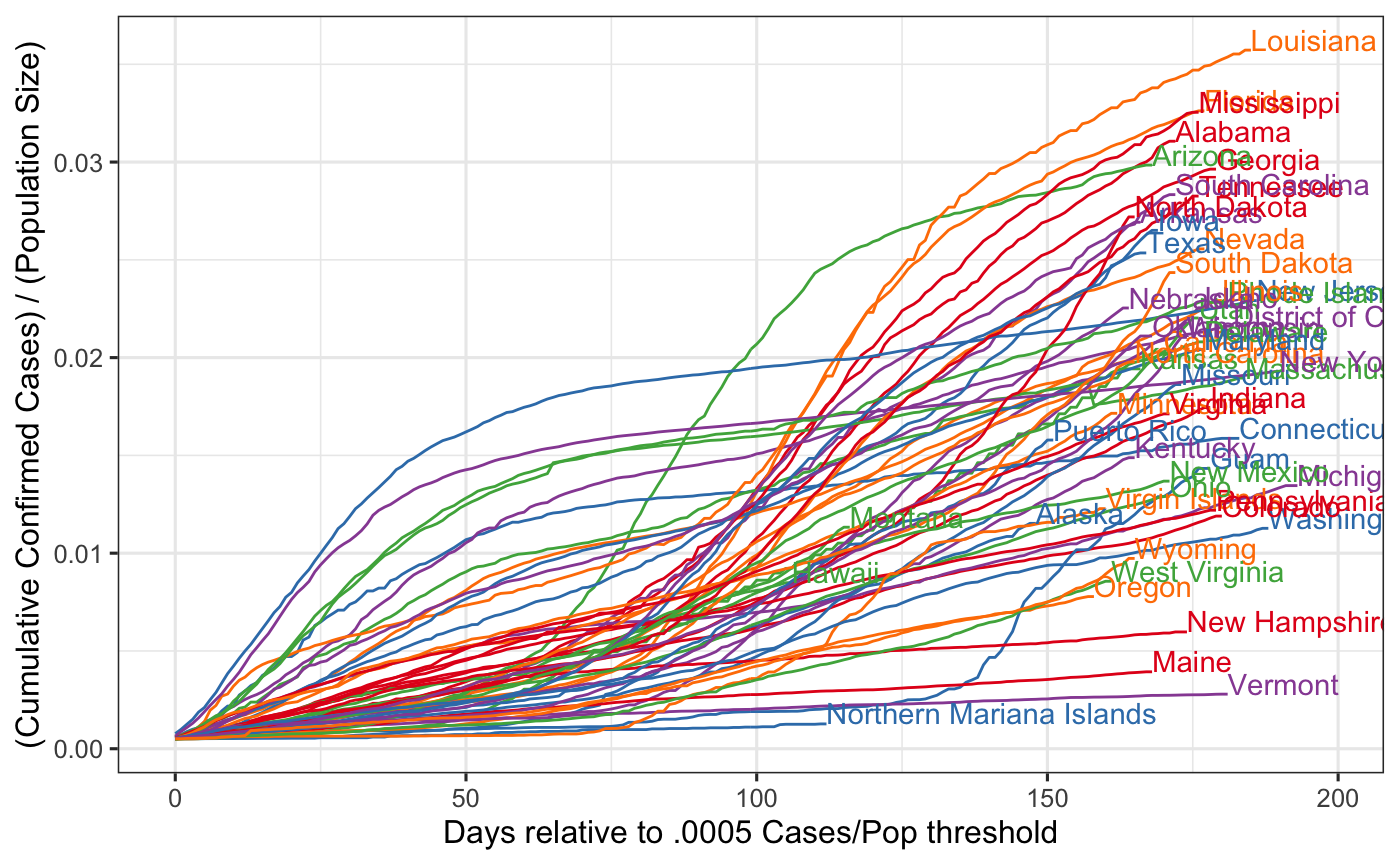
Now it looks like New Jersey, in fact, looks like it has a worse outbreak than New York?
Which picture shows the truth?
We can play the same game over and over, we can pick arbitrary time points or thresholds to plot the relative time of the outbreak. As we see, this time point can skew our view of the outbreak.
An alternative to this arbitrary scaling is to use Time Free Analysis (TFA).
Adding in the Recovered
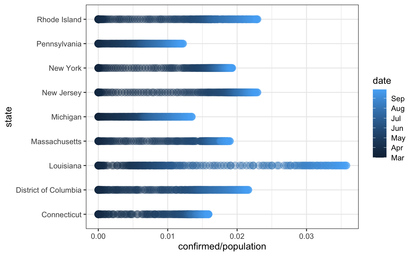
gamma <- 1/14 # assuming 14 days recovery
data3 <- data %>% group_by(state) %>%
  mutate(new_cases = confirmed - lag(confirmed),
         lag1_cases = lag(confirmed)) %>%
  mutate(new_cases = ifelse(is.na(new_cases) | new_cases < 0, 0, new_cases)) %>%
  mutate(new_recov = rbinom(n = 1, size = lag1_cases, prob = gamma))

states <- c("New York", "New Jersey", "Louisiana",
                                          "Massachusetts", "Connecticut",
                                          "District of Columbia", "Rhode Island",
                                          "Michigan", "Pennsylvania")

ggplot(data = data %>% filter(state %in% states), aes(x = confirmed / population,
                        y= state,
                        group = state, col = date)) +
  geom_point(size = 4, alpha = .4)
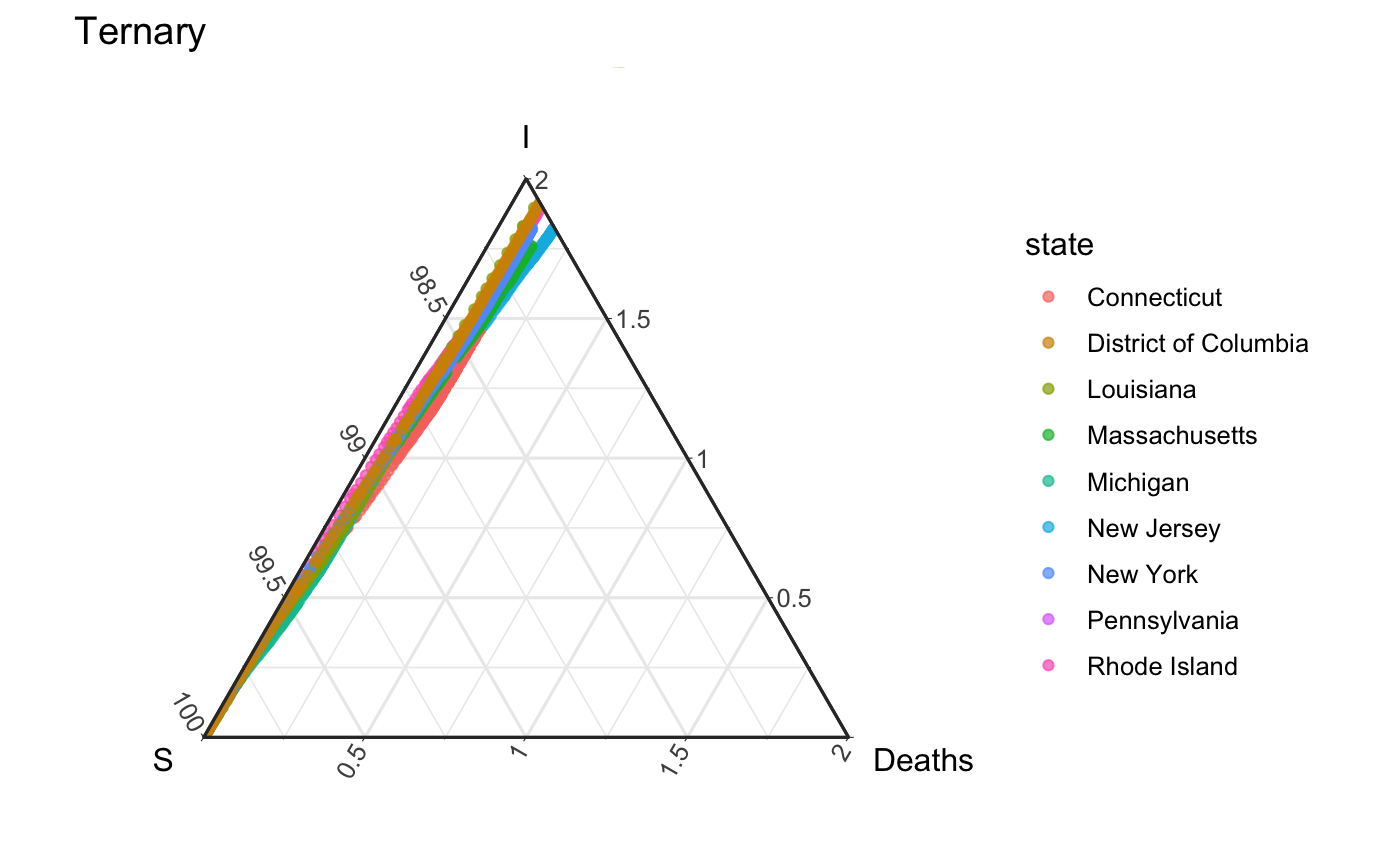
deaths <- data %>% group_by(state) %>%
  mutate(time = date,
        S = (population - confirmed) / population * 100,
         I = (confirmed - deaths) / population * 100,
        Deaths = deaths / population * 100) %>%
  select(state, time, S, I, Deaths) %>% na.omit()

sub <- deaths %>% filter(state == "Pennsylvania")


ggplot(data = deaths %>% filter(state %in% states),
       aes(x = S, y = I, z = Deaths, group = state, col = state)) +
  geom_point(alpha = .7) + coord_tern() + theme_zoom_L(.02)  +
  labs(title = "Ternary")
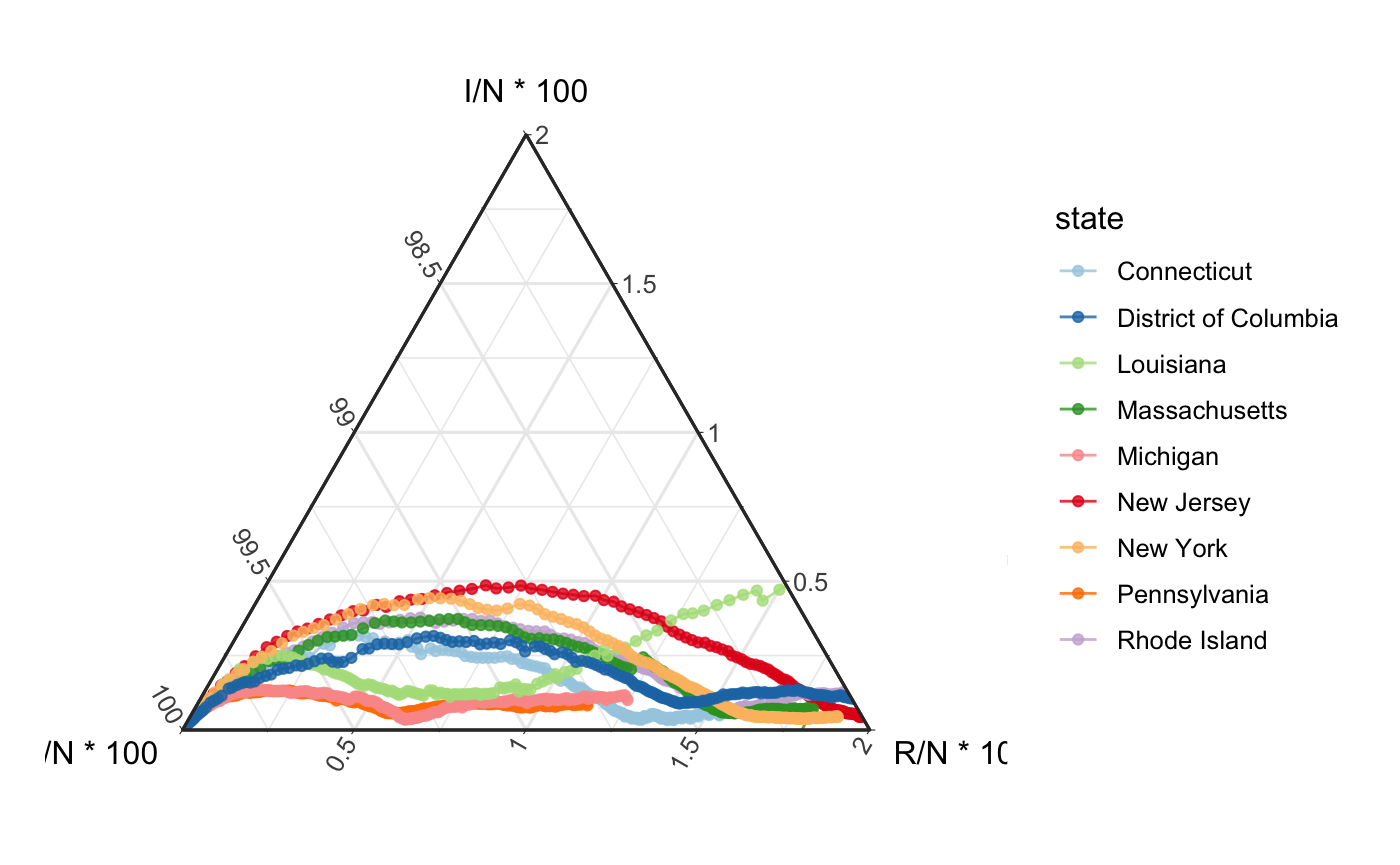
data_grouped <- data %>% group_by(state) %>%
  rename(t = date, N = population)

out <- cases_to_SIR(data_grouped, par = c("gamma" = 1/14)) %>%
  rename(S = X0, I = X1, R = X2)


ggplot(data = out %>% filter(state %in% states),
       aes(x = S / N * 100, y = I/ N * 100, z = R/ N * 100, group = state, col = state)) + coord_tern() + geom_path(alpha = .8) +
  geom_point(alpha = .8) +  theme_zoom_L(.02) +
  scale_color_brewer(palette = "Paired")
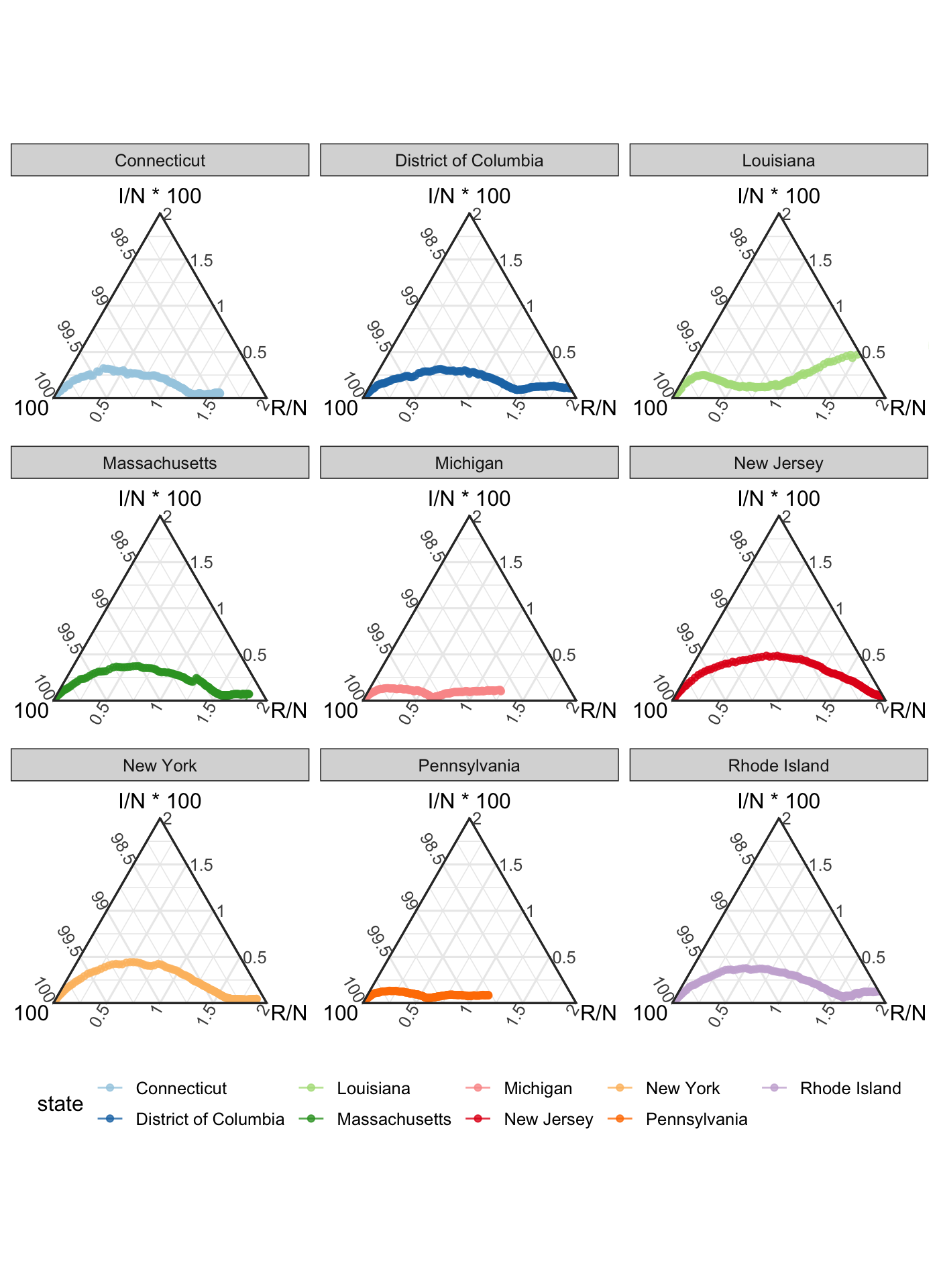
ggplot(data = out %>% filter(state %in% states),
       aes(x = S / N * 100, y = I/ N * 100, z = R/ N * 100, group = state, col = state)) + coord_tern() + geom_path(alpha = .8) +
  geom_point(alpha = .8) +  theme_zoom_L(.02) +
  scale_color_brewer(palette = "Paired") + facet_wrap(~state) +
  theme(legend.position = "bottom")
References
Dong, Ensheng, Hongru Du, and Lauren Gardner. 2020. “An Interactive Web-Based Dashboard to Track Covid-19 in Real Time.” The Lancet Infectious Diseases.
Guidotti, Emanuele. n.d. “Coronavirus Covid-19 (2019-nCoV) Epidemic Datasets.” Kaggle. https://doi.org/10.34740/KAGGLE/DS/574488.