Comparing Models (to Models) and Epidemics (to Models)
Source:dev/vignettes/not-built-vignettes/comparing-bands-and-assessing-containment.Rmd
comparing-bands-and-assessing-containment.Rmdif(!require(EpiCompare)){ library(devtools) devtools::install_github("skgallagher/EpiCompare") } library(EpiCompare) library(dplyr) library(tidyr) library(ggplot2)
Overview
Unfold
This package provides you the ability to create bands that are high dimensional (say beyond a 3d simplex). It also allows for you to compare bands (using Haussdorff distance) and examine containment of curves.
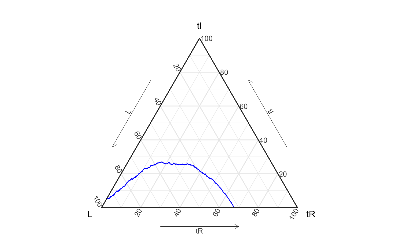
To motivate these tools we present a SIR example. Below we’ve generated a pretend_actual_data-set (i.e. made up data) and a set of simulations (i.e. draws from stochastic models).
geom_aggregate on our data (though we also could have used agents_to_aggregate + geom_path).
set.seed(1)
pretend_actual_data <- EpiCompare::simulate_SIR_agents(
                          n_sims = 1,
                          n_time_steps = 1000,
                          beta = .0099, gamma = .0029,
                          init_SIR = c(950, 50, 0))


pretend_actual_data %>%
  ggplot() +
  geom_aggregate(aes(y = tI, z = tR),
                 color = "blue") +
  coord_tern() +
  theme_sir()
#> Coordinate system already present. Adding new coordinate system, which will replace the existing one.
# another approach for the same visual
df_single <- pretend_actual_data %>%
  agents_to_aggregate(states = c("tI", "tR")) %>%
  rename(S = "X0", I = "X1", R = "X2")
# visual not run...
ggplot(df_single, aes(x = S, y = I, z = R)) +
  geom_path(color = "blue") +
  coord_tern() + theme_sir()
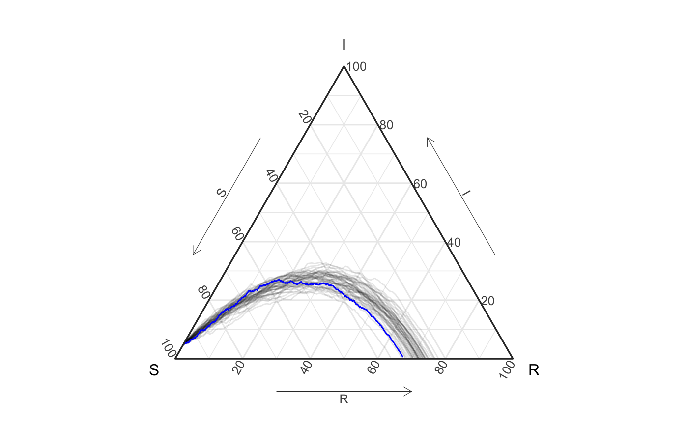
Now, suppose, as in real life, you do not know how the original data were generated, but you still think the following model is a good fit for the data. We can plot the data (blue) on top of the simulated paths (gray) and do so, below. Intuitively, if the model is a good fit, we might expect the blue curve to be centered (or at least contained) within the gray curves.
n_sims <- 50
n_time_steps <- 100
beta <- .1
gamma <- .03
init_SIR <- c(950, 50, 0)


sim50 <- simulate_SIR_agents(n_sims = n_sims,
                             n_time_steps = n_time_steps,
                             beta = beta, gamma = gamma,
                             init_SIR = init_SIR)

df_group <- sim50 %>% group_by(sim) %>%
  agents_to_aggregate(states = c("tI", "tR")) %>%
                      #min_max_time = c(0,100)) %>%
  rename(S = "X0", I = "X1", R = "X2")
ggplot() +
  geom_aggregate(data = sim50, aes(y = tI, z = tR, group = sim),
                 alpha = .1) +
  geom_aggregate(data = pretend_actual_data,
                 aes(y = tI, z = tR), color = "blue") +
  coord_tern() +
  labs(x = "S", y = "I", z = "R") +
  theme_sir()
#> Coordinate system already present. Adding new coordinate system, which will replace the existing one.
# again, aggregate version (visual not run):
ggplot(df_group) +
  geom_path(aes(x = S, y = I, z = R, group = sim),
            alpha = .1) +
  geom_path(data = df_single, aes(x = S, y = I, z = R), color = "blue") +
  coord_tern() +
  labs(x = "S", y = "I", z = "R") +
  theme_sir()
How close is this model?
Great! The visualization looks like you made a good estimate of the SIR model parameters. But how good? Would a 60% prediction interval contain the true epidemic?
We propose to assess this question with containment of the epidemic with a band using 60% of the simulations - specifically the top 60% most globally deep filaments of simulations. (Please see this article for an explanation of global depth and filaments.)
We define the delta ball containment band as:
delta_ball_cb <- df_group %>%
  arrange(t) %>% # just to be safe
  select(-t) %>%
  group_by(sim) %>%
  grab_top_depth_filaments(conf_level = .6) %>%
  create_delta_ball_structure()
Which is just a data version (not exactly, but close) of the following visualization:
ggplot() +
  geom_prediction_band(data = df_group,
                       aes(x = S, y = I, z = R,
                           sim_group = as.numeric(sim)),
                       conf_level = .6, pb_type = "delta_ball",
                       grid_size = rep(50,2)) +
  geom_path(data = df_single, aes(x = S, y = I, z = R), color = "blue") +
  coord_tern() +
  theme_sir()
#> Warning: Ignoring unknown aesthetics: z
#> Coordinate system already present. Adding new coordinate system, which will replace the existing one.
#> Due to dist_params$dist_approach = "equa_dist", this may take a little while - see `filament_compression` examples for a work-around if you're making this plot multiple times
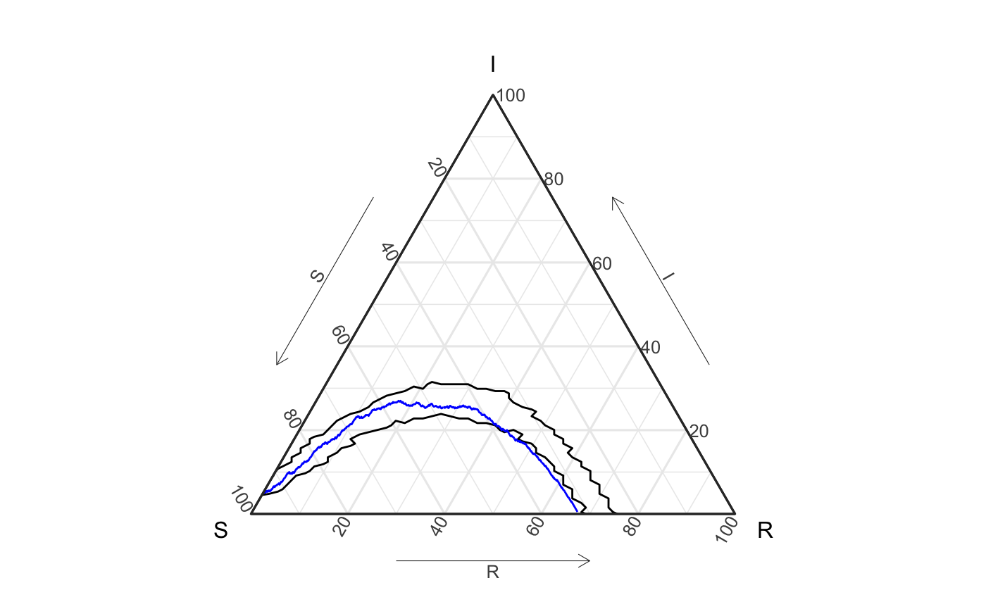
Is the data (blue) contained in the above delta ball?
What about a less stringent ruling (maybe a more typical prediction band with 90% confidence)?
delta_ball_cb1 <- df_group %>%
  arrange(t) %>% # just to be safe
  select(-t) %>%
  group_by(sim) %>%
  grab_top_depth_filaments(conf_level = .9) %>%
  create_delta_ball_structure()
Comparing one set of simulations to another
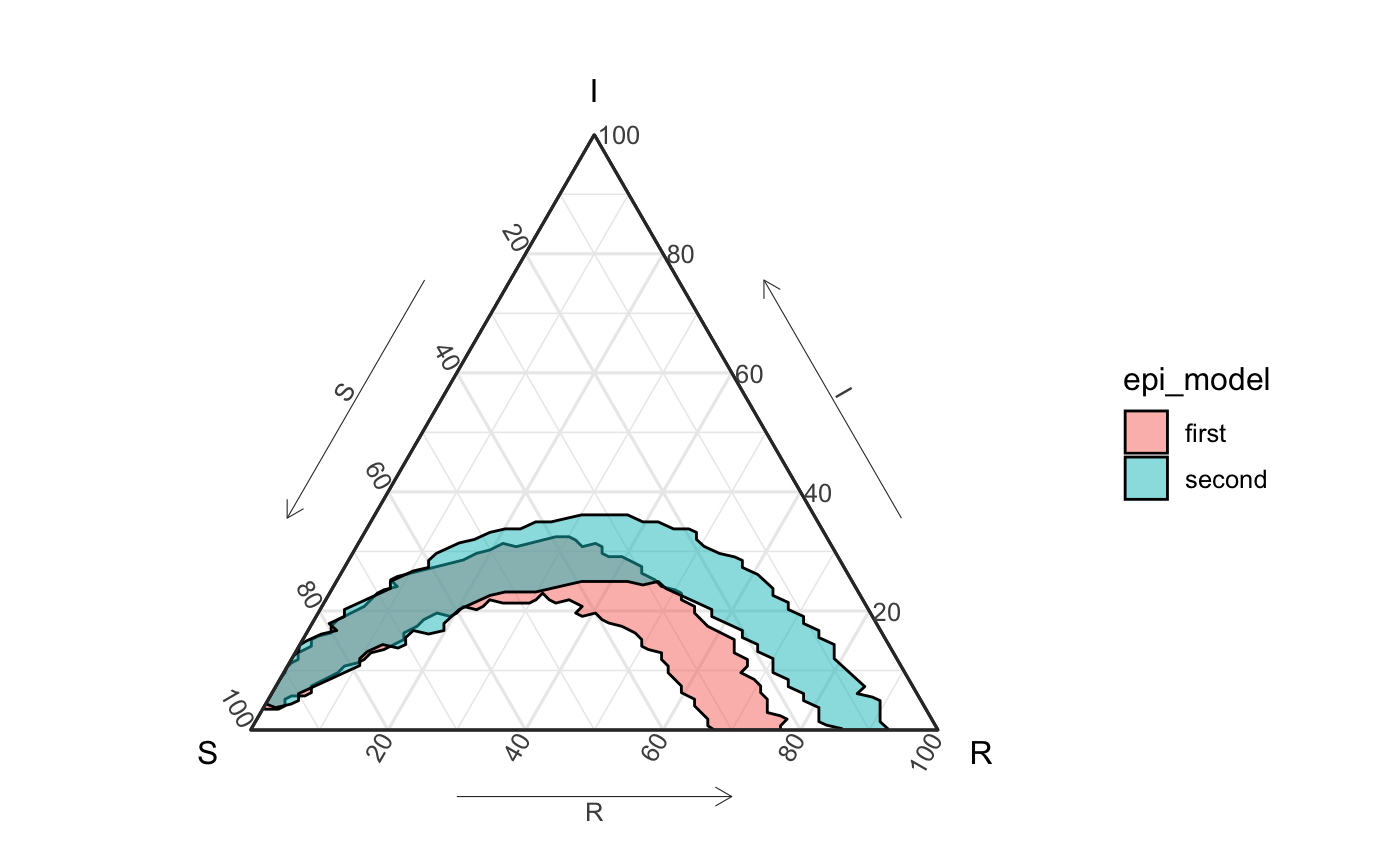
Suppose your lab has seen an epidemic that has similar characteristics as the current epidemic, and had already built simulations below for such an occasion:
beta <- .15
gamma <- .05


sim50_2 <- simulate_SIR_agents(n_sims = 50,
                               n_time_steps = 100,
                               beta = beta, gamma = gamma,
                               init_SIR = c(950, 50, 0))

df_group2 <- sim50_2 %>% group_by(sim) %>%
  agents_to_aggregate(states = c("tI", "tR")) %>%
  rename(S = "X0", I = "X1", R = "X2")
Motivating visuals
Below we present four different ways to visualize the different sets of simulations. The first two generate the same plot but are constructed differently. The first plot combines the two data frames of simulations together and groups them by the model type. The second plot plots a separate layer for each set of simulations. The third and fourth plots also generate the same resulting figures. This time, the individual simulation paths are shown. The third plot uses EpiCompare::agents_to_aggregate to first format the raw agent data into a form to be plotted with ggplot2::geom_path. The fourth plot uses EpiCompare::geom_aggregate on the raw agent data to directly create the visualization.
Regardless of which visualization we use, it is evident that the two sets of simulations produce fairly different sets. However, we also see that there is significant overlap until about 60% of the population is infected, meaning that the two different sets of simulations may be indistinguishable from one another at the beginning of the epidemic.
Plotting (Way 1)
df_all <- rbind( df_group %>% ungroup() %>% mutate(sim = as.character(sim),
                                                   epi_model = "first"),
                df_group2 %>% ungroup() %>% mutate(sim = as.character(sim),
                                                   epi_model = "second"))
ggplot() +
  geom_prediction_band(data = df_all,
                       aes(x = S, y = I, z = R, fill = epi_model,
                           sim_group = as.numeric(sim)), alpha = .5,
                       conf_level = .9, pb_type = "delta_ball",
                       grid_size = rep(50, 2))  +
  coord_tern() +
  theme_sir()
#> Coordinate system already present. Adding new coordinate system, which will replace the existing one.
#> Due to dist_params$dist_approach = "equa_dist", this may take a little while - see `filament_compression` examples for a work-around if you're making this plot multiple times
#> Due to dist_params$dist_approach = "equa_dist", this may take a little while - see `filament_compression` examples for a work-around if you're making this plot multiple times
Plotting (Way 2)
# visual not run
ggplot() +
  geom_prediction_band(data = df_group,
                       aes(x = S, y = I, z = R,
                           sim_group = as.numeric(sim)),
                       color = "blue",
                       fill = "blue", alpha = .5,
                       conf_level = .9, pb_type = "delta_ball",
                       grid_size = rep(50, 2)) +
  geom_prediction_band(data = df_group2,
                       aes(x = S, y = I, z = R,
                           sim_group = as.numeric(sim)),
                       color = "red",
                       fill = "red", alpha = .5,
                       conf_level = .9, pb_type = "delta_ball",
                       grid_size = rep(50, 2)) +
  coord_tern() +
  theme_sir()
Plotting (Way 3)
# visual not run
df_all <- rbind(df_group %>% ungroup() %>%
                  mutate(sim = as.numeric(as.character(sim)),
                         epi_model = "first"),
                df_group2 %>% ungroup() %>%
                  mutate(sim = as.numeric(as.character(sim)),
                         epi_model = "second"))
ggplot() +
  geom_path(data = df_all,
            aes(x = S, y = I, z = R, color = epi_model,
                group = factor(paste(epi_model,sim))),
                alpha = .1)  +
  coord_tern() +
  theme_sir()
Plotting (Way 4)
# this would also work (and is not run)
df_all_agents <- rbind(sim50 %>% mutate(epi_model = "first"),
                sim50_2 %>% mutate(epi_model = "second"))

ggplot() +
  geom_aggregate(data = df_all_agents,
            aes(y = tI, z = tR, color = epi_model,
                group = factor(paste(epi_model,sim))),
                alpha = .1)  +
  coord_tern() +
  labs(x = "S", y = "I", z = "R") +
  theme_sir()
Numerical comparison (good for higher dimensional models)
Above we saw how to compare observed epidemic data to a model (through simulations), and how to visually compare simulations in a time-invariant manner. Naturally, we can also compare models (and the geometric prediction bands they generate), though geometric summary statistics.
We provide one such metric, the Hausdorff Distance, which defines the distance between sets (but the minimum distance that each set must expand to cover the other set). Specifically hausdorff_dist() can calculate this distance between delta_ball and convex_hull based prediction bands (with classes delta_ball_structure and convex_hull_structure respectively).
delta_ball_cb_group2 <- df_group2 %>%
  arrange(t) %>% # just to be safe
  select(-t) %>%
  group_by(sim) %>%
  grab_top_depth_filaments(conf_level = .9) %>%
  create_delta_ball_structure()
hausdorff_dist(delta_ball_cb1, delta_ball_cb_group2)
#> [1] 0.2294748